Hackathons – all-night coding sessions where engineers create new products that aren’t part of their daily work – are at the heart of Facebook’s culture. For my latest hackathon project I rebuilt an internal tool called Pixelcloud (we originally wrote about it in 2009). Pixelcloud is a simple internal site used mostly by Facebook’s design team that allows you to upload images so other employees can comment on them. Designers use it to upload mocks and screenshots of prototypes to start discussions and critiques, but other employees use it as well as sort of an internal photo sharing tool.
After the hackathon, the reaction to the new Pixelcloud was very positive: image uploads increased by over 20 percent and comments rose by more than 40 percent.
Pixelcloud has just two pages, a homepage that shows a list of images, and a specific image page where users can comment on or like the image. The underlying code had changed little over its four year lifespan, and while it was still functional, it hadn’t kept up with the needs of the growing design team. In addition, flaky and unused features cluttered the interface. I wanted to rejuvenate the tool and add new features that would keep designers uploading their prototypes.
I recruited a designer, Ben Blumenfeld, and another engineer, Jackson Gabbard, and we set out to completely rebuild the tool from scratch. Ben designed the layout and interactions as I started building out the stubs for the front end pieces. Jackson overhauled the back end to move to our DFS3 storage from our antiquated NFS mount, as well as restructuring our database queries to be more efficient. We ended up with a completely fresh take on a product used everyday within the company, building it on top of our latest frameworks including XHP.
Before and After
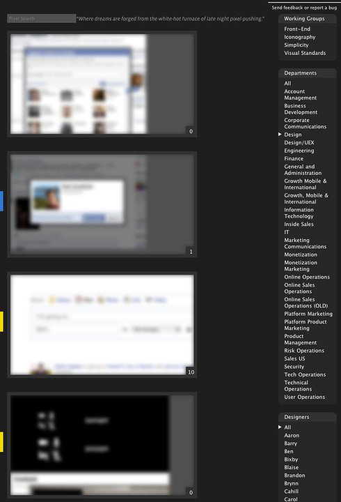
The original Pixelcloud homepage laid photos out vertically, with a long list of departments and another list of designers. It also included the now-unused working groups. There was a search feature, but it ran a full text search that was slow and made it difficult to find what you wanted.
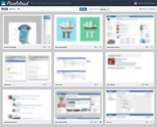
The new design floats images into a grid, using the space on employees’ large monitors more efficiently. It also collapses all functionality into the header, which includes a new tag/user search capability, a quick link to see new trending “hot” posts, and a direct link to your own posts. We condensed the departments into a single drop down and removed the unused working group section.
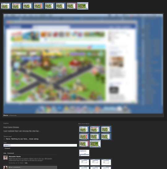
The original Pixelcloud image page featured all images uploaded by the same person within a short time frame. It supported image tagging, but people rarely used the feature because it was lacking search. All images by the user would also be listed along the side at the bottom.
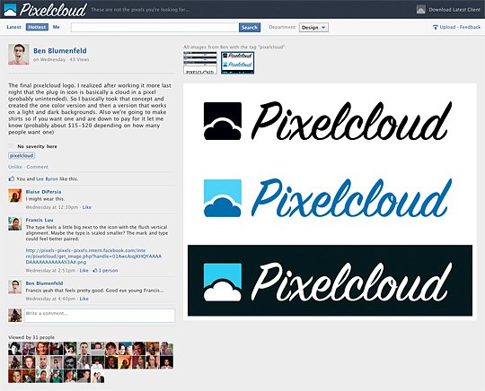
The new Pixelcloud image page moves the caption and comments to the left of the image, so they are immediately visible. We also grouped images together by user and tag, no matter how far apart they were uploaded. Finally, we added page view counts and a list of employees who viewed the image. Designers could sometimes get discouraged when they uploaded an image and received little feedback — they weren’t sure if people had difficulty seeing their designs or had nothing to say. The new Pixelcloud lets designers know that people looked at their work, and that factors into the algorithms to determine what was trending as a “hot” Pixelcloud post.
The entire project took less than 10 days to complete from the first all-night hackathon session until the code went live.


