Facebook.com launched in 2004 as a simple, server-rendered PHP website. Over time, we’ve added layer upon layer of new technology to deliver more interactive features. Each of these new features and technologies incrementally slowed the site down and made it harder to maintain. This made it harder to introduce new experiences. Features like dark mode and saving your place in News Feed had no straightforward technical implementation. We needed to take a step back to rethink our architecture.
When we thought about how we would build a new web app — one designed for today’s browsers, with the features people expect from Facebook — we realized that our existing tech stack wasn’t able to support the app-like feel and performance we needed. A complete rewrite is extremely rare, but in this case, since so much has changed on the web over the course of the past decade, we knew it was the only way we’d be able to achieve our goals for performance and sustainable future growth. Today, we’re sharing the lessons we’ve learned while rearchitecting Facebook.com, using React (a declarative JavaScript library for building user interfaces) and Relay (a GraphQL client for React).
Getting started
We knew we wanted Facebook.com to start up fast, respond fast, and provide a highly interactive experience. Although a server-driven app could deliver a fast startup time, we weren’t convinced we could make it as interactive and delightful as a client-driven app. However, we believed we could build a client-driven app with a competitively fast startup time.
But starting from the ground up with a client-first app brought a new set of problems. We needed to rebuild the tech stack quickly while also addressing speed and other user experience issues — and we needed to do it in such a way that it would be sustainable for years to come.
Throughout the process, we anchored our work around two technical mantras:
- As little as possible, as early as possible. We should deliver only the resources we need, and we should strive to have them arrive right before we need them.
- Engineering experience in service of user experience. The end goal of our development is all about the people using our website. As we think about the UX challenges on our site, we can adapt the experience to guide engineers to do the right thing by default.
We applied these same principles to improve four main elements of the site: CSS, JavaScript, data, and navigation.
Rethinking CSS to unlock new capabilities
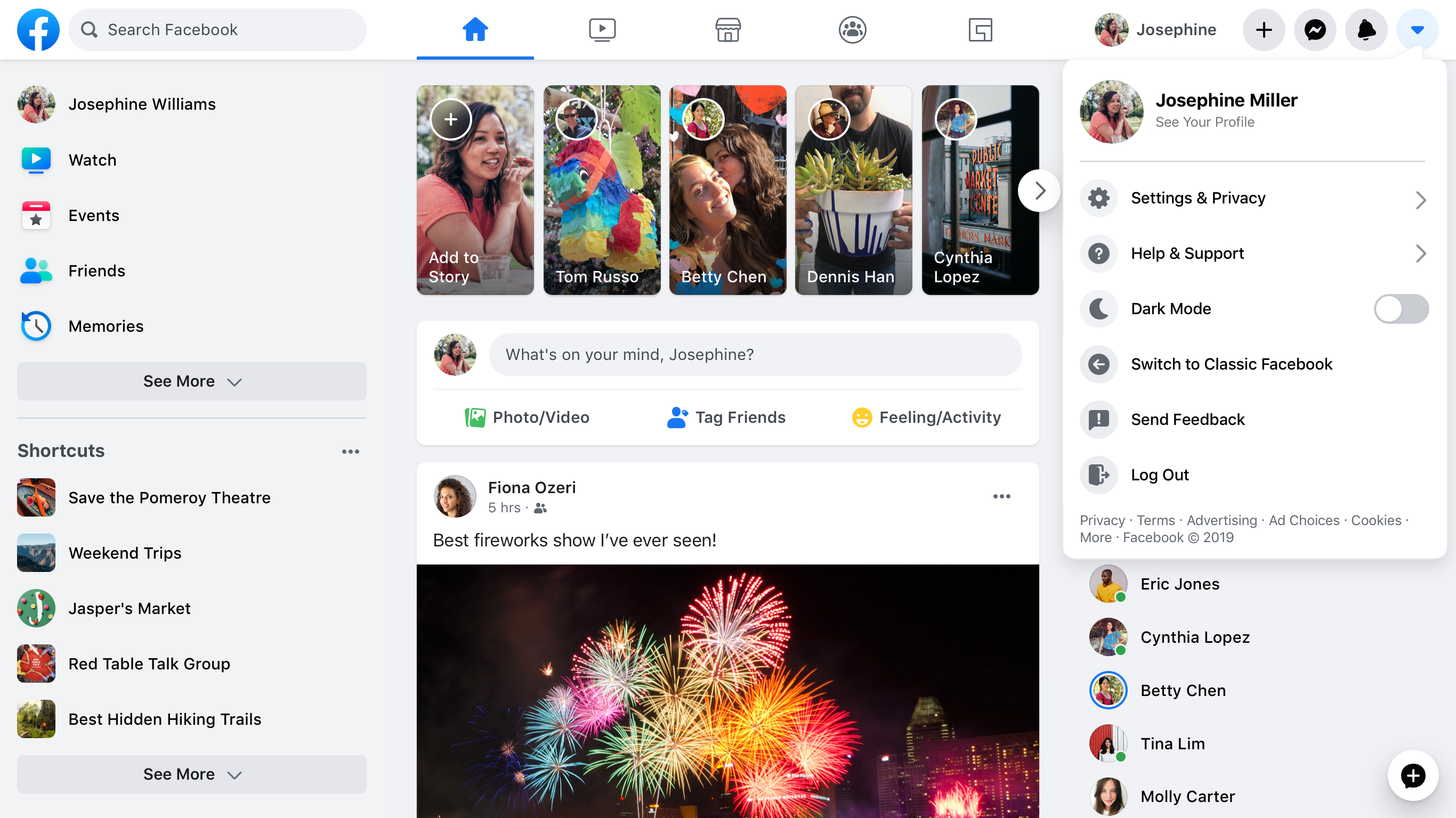
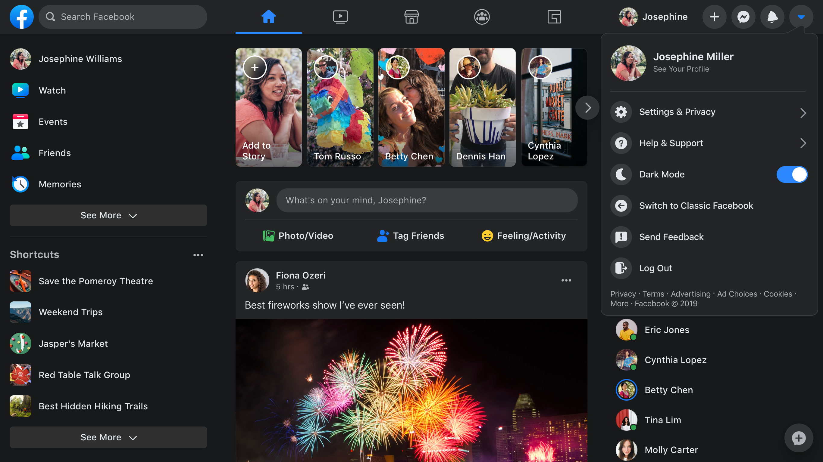
First, we reduced the CSS on the homepage by 80 percent by changing how we write and build our styles. On the new site, the CSS we write is different from what gets sent to the browser. While we write familiar CSS-like JavaScript in the same files as our components, a build tool splits these styles into separate, optimized bundles. As a result, the new site ships less CSS, supports dark mode and dynamic font sizes for accessibility, and has improved image rendering performance — all while making it easier for engineers to work with.
Generating atomic CSS to reduce homepage CSS by 80 percent
On our old site, we were loading more than 400 KB of compressed CSS (2 MB uncompressed) when loading the homepage, but only 10 percent of that was actually used for the initial render. We didn’t start out with that much CSS; it just grew over time and rarely decreased. This happened in part because every new feature meant adding new CSS.
We addressed this by generating atomic CSS at build time. Atomic CSS has a logarithmic growth curve because it’s proportional to the number of unique style declarations rather than to the number of styles and features we write. This lets us combine the generated atomic CSS from across our site into a single, small, shared stylesheet. As a result, the new homepage downloads less than 20 percent of the CSS the old site downloaded.
Colocating styles to reduce unused CSS and make it easier to maintain
Another reason our CSS grew over time was that it was difficult to identify whether various CSS rules were still in use. Atomic CSS helps mitigate the performance impact of this, but unique styles still add unnecessary bytes, and the unused CSS in our source code adds engineering overhead. Now, we colocate our styles with our components so they can be deleted in tandem, and only split them into separate bundles at build time.
We also addressed another issue we were facing: CSS precedence depends on ordering, which is especially difficult to manage when using automated packaging that can change over time. It was previously possible for changes in one file to break the styles in another without the author realizing it. Instead, we now author styles using a familiar syntax inspired by React Native styling APIs: We guarantee that the styles are applied in a stable order, and we don’t support CSS descendant selectors.
Changing font sizes for better accessibility
We’ve taken advantage of our offline build step to make accessibility updates as well. On many websites today, people enlarge text by using their browser’s zoom function. This can accidentally trigger a tablet or mobile layout or increase the size of things they didn’t need to enlarge, such as images.
By using rems, we can respect user-specified defaults and are able to provide controls for customizing font size without requiring changes to the stylesheet. Designs, however, are usually created using CSS pixel values. Manually converting to rems adds engineering overhead and the potential for bugs, so we have our build tool do this conversion for us.
Sample build-time handling
const styles = stylex.create({
  emphasis: {
    fontWeight: 'bold',
  },
  text: {
    fontSize: '16px',
    fontWeight: 'normal',
  },
});

function MyComponent(props) {
  return <span className={styles('text', props.isEmphasized && 'emphasis')} />;
}
Example of source code.
.c0 { font-weight: bold; }
.c1 { font-weight: normal; }
.c2 { font-size: 0.9rem; }
Example of generated CSS.
function MyComponent(props) {
  return <span className={(props.isEmphasized ? 'c0 ' : 'c1 ') + 'c2 '} />;
}
Example of generated JavaScript.
CSS variables for theming (dark mode)
On the old site, we used to attempt to apply themes by adding a class name to the body element and then using that class name to override existing styles with rules that had a higher specificity. This approach has issues, and it no longer works with our new atomic CSS-in-JavaScript approach, so we have switched to CSS variables for theming.
CSS variables are defined under a class, and when that class is applied to a DOM element, its values are applied to the styles within its DOM subtree. This lets us combine the themes into a single stylesheet, meaning toggling different themes doesn’t require reloading the page, different pages can have different themes without downloading additional CSS, and different products can use different themes side by side on the same page.
.light-theme {
  --card-bg: #eee;
}
.dark-theme {
  --card-bg: #111;
}
.card {
  background-color: var(--card-bg);
}
This made the performance impact of a theme proportional to the size of the color palette rather than to the size or complexity of the component library. A single atomic CSS bundle also includes the dark mode implementation.
SVGs in JavaScript for fast, single-render performance
To prevent flickering as icons come in after the rest of the content, we inline SVGs into the HTML using React rather than passing SVG files to <img> tags. Because these SVGs are now effectively JavaScript, they can be bundled and delivered together with their surrounding components for a clean one-pass render. We’ve found that the upside of loading these at the same time as the JavaScript was greater than the cost of SVG painting performance. By inlining, there’s no flickering of icons that pop in afterward.
function MyIcon(props) {
  return (
    <svg {...props} className={styles({/*...*/})}>
       <path d="M17.5 ... 25.479Z" />
    </svg>
  );
}
Additionally, these icons can change colors smoothly at runtime without requiring further downloads. We’re able to style the icon according to its props and use our CSS variables to theme certain types of icons, especially ones that are monochrome.
Code-splitting JavaScript for faster performance
Code size is one of the biggest concerns with a JavaScript-based single-page app because it has a large influence on page load performance. We knew that if we wanted a client-side React app for Facebook.com, we’d need to solve for this. We introduced several new APIs that work in line with our “as little as possible, as early as possible” mantra.
Incremental code download to deliver just what we need, when we need it
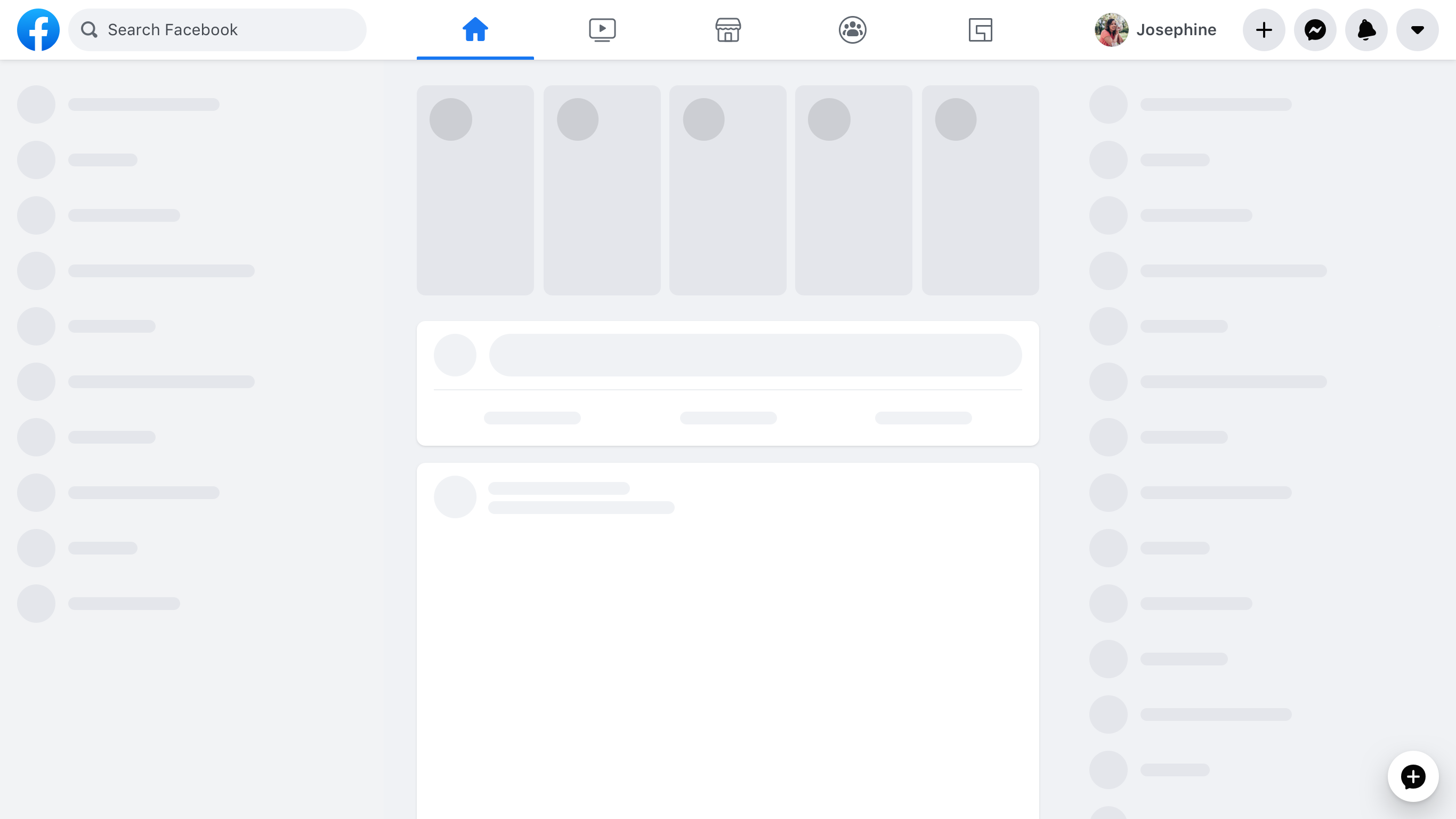
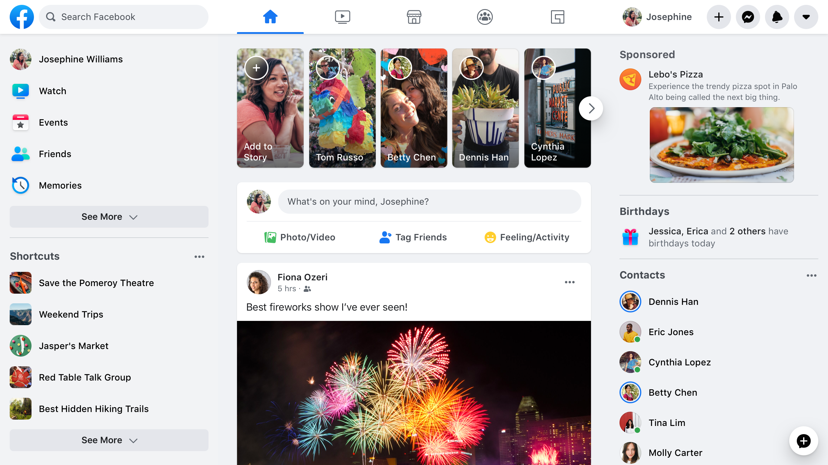
When someone is waiting for a page to load, our goal is to give immediate feedback by rendering UI “skeletons” of what the page is going to look like. This skeleton needs minimal resources, but we can’t render it early if our code is packaged in a single bundle, so we need to code-split into bundles based on the order in which the page should be displayed. However, if we do this naively (i.e., by using dynamic imports that are fetched during render), we could hurt performance instead of helping it. This is the basis of our code-splitting design of JavaScript Loading Tiers: We split the JavaScript needed for the initial load into three tiers, using a declarative, statically analyzable API.
Tier 1 is the basic layout needed to display the first paint for the above-the-fold content, including UI skeletons for initial loading states.
import ModuleA from 'ModuleA';Tier 1 uses regular importsyntax.
Tier 2 includes all the JavaScript needed to fully render all above-the-fold content. After Tier 2, nothing on the screen should still be visually changing as a result of code loading.
importForDisplay ModuleBDeferred from 'ModuleB';Once an importForDisplay is encountered, it and its dependencies are moved into Tier 2. This returns a promise-based wrapper to access the module once it’s loaded.
Tier 3 includes everything that is only needed after display that doesn’t affect the current pixels on the screen, including logging code and subscriptions for live-updating data.
importForAfterDisplay ModuleCDeferred from 'ModuleC';

// ...

function onClick(e) {
  ModuleCDeferred.onReady(ModuleC => {
    ModuleC.log('Click happened! ', e);
  });
}
Once an importForAfterDisplay is encountered, it and its dependencies are moved into Tier 3. This returns a promise-based wrapper to access the module once it’s loaded.
A 500 KB JavaScript page can become 50 KB in Tier 1, 150 KB in Tier 2, and 300 KB in Tier 3. Splitting our code this way enables us to improve time to first paint and time to visual completion by reducing the amount of code that needs to be downloaded to hit each milestone. Because Tier 3 doesn’t affect the pixels on the screen, it isn’t really a render, and the final paint finishes earlier. Most significantly, the loading screen is able to render much earlier.
Delivering experiment-driven dependencies only when they’re needed
We often need to render two variations of the same UI, e.g., in an A/B test. The simplest way to do this is to download both versions for all people, but this means we often download code that is never executed. A slightly better approach is to use dynamic imports on render, but this can be slow.
Instead, in keeping with our “as little as possible, as early as possible” mantra, we built a declarative API that alerts us to these decisions early and encodes them in our dependency graph. As the page is loading, the server is able to check the experiment and send down only the required version of the code.
const Composer = importCond('NewComposerExperiment', {
  true: 'NewComposer',
  false: 'OldComposer',
});
This works well when the conditions we split on are static across page loads for that person, such as A/B tests, locales, or device classes.
Delivering data-driven dependencies only when they’re needed
What about code branches that are not static across page loads? For example, sending down all the rendering code for all the different types and combinations of components for News Feed posts would considerably bloat the page’s JavaScript size.
These dependencies are decided at runtime, based on which data is returned from the back end. This allows us to use a new feature of Relay to express which rendering code is needed, depending on what type of data is returned. If the post has a special attachment, such as a photo, we describe that we need the PhotoComponent in order to render that photo.
... on Post {
  ... on PhotoPost {
    @module('PhotoComponent.js')
    photo_data
  }
  ... on VideoPost {
    @module('VideoComponent.js')
    video_data
  }
}
We express the dependencies needed to render each post type as part of the query.
Even better, the PhotoComponent itself describes exactly which data on the photo attachment type it needs as a fragment, which means we can even split out the query logic.
Using JavaScript budgets to prevent code creep
Tiers and conditional dependencies help us deliver just the code necessary for each phase, but we also need to make sure the size of each tier stays under control over time. To manage this, we’ve introduced per-product JavaScript budgets.
We set budgets based on performance goals, technical constraints, and product considerations. We allocated page-level budgets and subdivide the page based on product boundaries and team boundaries. Shared infra is added to a carefully curated list and given its own budget. Shared infra counts against all pages’ budgets, but modules within it are free for product teams to use. We also have budgets for code that’s deferred, conditionally loaded, or loaded on interaction.
We’ve created additional tooling for each step of the process:
- A dependency graph tool makes it easier to understand where bytes are coming from and identify opportunities to decrease code size.
- Size monitoring on merge requests displays size regressions/improvements and triggers customizable alerts.
- Interactive graphs show historical size and how things have changed between revisions.
- Dashboards help us understand the current state of sizes in relation to budgets.
Modernizing data-fetching to get it as early as possible
As part of this rebuild, we modernized our data-fetching infra on the web. While some features of the old site used Relay and GraphQL for data-fetching, most fetched data ad-hoc as part of their server-side PHP rendering. With the new site, we were able to standardize with our mobile apps and ensure that all data-fetching goes through GraphQL. Since Relay and GraphQL already handle the “as little as possible” work for us, we just needed to make some changes to support getting the data we needed as early as possible.
Preloading data on the initial server request to improve startup
Many web apps need to wait until all their JavaScript is downloaded and executed before fetching data from the server. With Relay, we know statically what data the page needs. This means that as soon as our server receives the request for a page, it can immediately start preparing the necessary data and download it in parallel with the required code. We stream this data with the page as it becomes available so the client can avoid additional round trips and render the final page content sooner.
Streaming data for fewer round trips and better interactivity
On the initial load of Facebook.com, some content may initially be hidden or rendered outside of the viewport. For example, most screens fit one or two News Feed posts, but we don’t know in advance how many will fit. Additionally, it’s very likely the user will scroll, and it would take time to fetch each story individually in a serial round trip. On the other hand, the more stories we fetch in one query, the slower that query gets, which leads to longer query times and a longer Visually Complete time for even the first story.
To solve this, we use an internal GraphQL extension, @stream, to stream the feed connection to the client both for initial load and subsequent pagination on scroll. This allows us to send each feed story as soon it’s ready, one by one, with just a single query operation.
fragment HomepageData on User {
  newsFeed(first: 10) {
    edges @stream
  }
  ...AdditionalData
}
Deferring data that’s not needed right away
Different parts of certain queries take longer to compute than others. For example, when viewing a profile, it’s relatively quick to fetch a person’s name and profile photo, but it takes a bit longer to fetch the contents of their Timeline.
To fetch both types of data with a single query, we use @defer, which enables different sections of the response to be streamed as soon as they’re ready. This lets us render the bulk of the UI with initial data as quickly as possible, and render loading states for the rest. With React Suspense, this is even easier, as we can explicitly craft our loading states to ensure a smooth, top-down page load experience.
fragment ProfileData on User {
  name
  profile_picture { ... }
  ...AdditionalData @defer
}
Route maps and definitions for faster navigation
Fast navigation is an important feature of single-page applications. When navigating to a new route, we need to fetch various code and data from the server to render the destination page. To reduce the number of network round trips required when loading a new page, the client needs to know which resources will be needed for each route ahead of time. We call this a route map and each entry a route definition.
Getting route definitions as early as possible
For Facebook, this route map is too large to send all at once. Instead, we dynamically add route definitions to the route map during the session, as new links are rendered. The route map and the router live at the very top of the application, allowing the combination of current application and router state to drive app-level state decisions, such as the behavior of the top navigation bar or chat tabs based on the current route.
Prefetching resources as early as possible
It’s common for client-side applications to wait until a page is being rendered by React to download the code and data needed for that page. Often this is done using React.lazy or a similar primitive. Since this can make page navigation slow, we instead start our first request for some of the necessary resources even before a link is clicked:
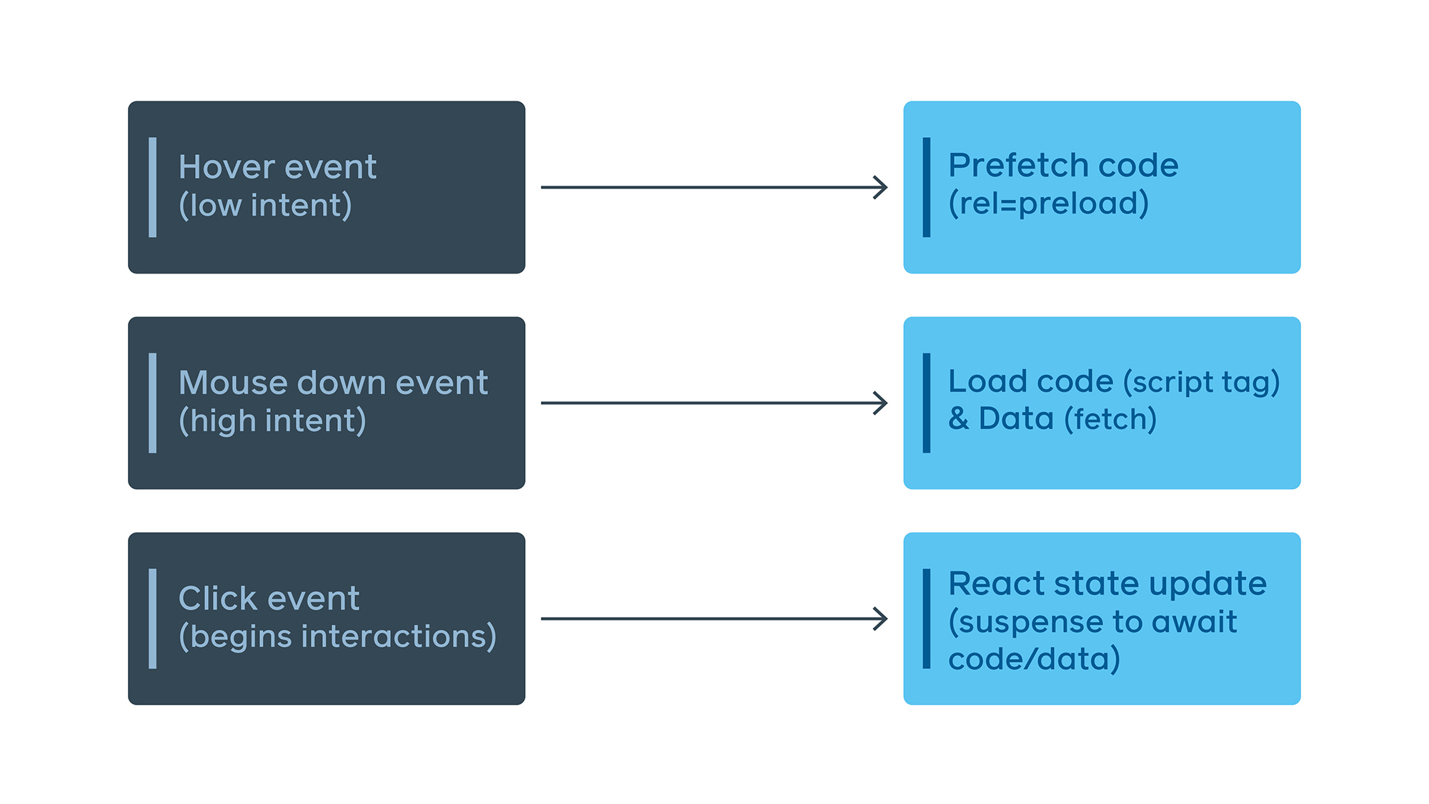
To provide a more fluid experience than just showing a blank screen when navigating, we use React Suspense transitions to continue rendering the previous route until the next route is either fully rendered or suspends into a “good” loading state with UI skeletons for the next page. This is much less jarring, and it mimics standard browser behavior.
Parallelizing code and data download
We do a lot of lazy loading of code on the new site, but if we lazy load the code for a route and the data-fetching code for that route lives inside of that code, we end up with a serial load.

To solve this problem, we came up with EntryPoints, which are files that wrap a code-split point and transform inputs into queries. These files are very small and are downloaded in advance for any reachable code-split point.
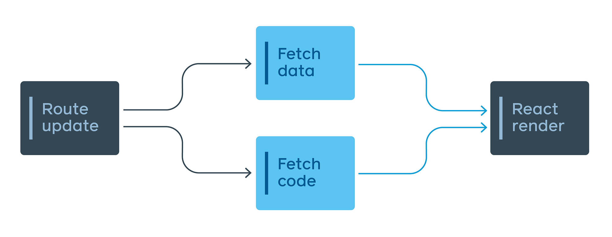
The GraphQL query is still colocated with the view, but the EntryPoint encapsulates when that query is needed and how to transform the inputs into the correct variables. The app uses these EntryPoints to automatically decide when to fetch the resources, making sure the right thing happens by default. This has the added benefit of creating a single JavaScript function that contains all the data-fetching needs for any given point in the app, which can be used for the server preloading discussed earlier.
Many of the changes we’ve discussed here are not specific to Facebook. These concepts and patterns can be applied to any client-side app using any framework or library. By standardizing our tech stack, we have been able to rethink how we introduce functionality that people want in a performant, sustainable way — even as we operate at engineering and product scale.
Engineering experience improvements and user experience improvements must go hand in hand, and performance and accessibility cannot be viewed as a tax on shipping features. With great APIs, tools, and automation, we can help engineers move faster and ship better, more performant code at the same time. The work done to improve performance for the new Facebook.com was extensive and we expect to share more on this work soon. To check out the redesign, visit facebook.com/new. It’s rolling out gradually and will be available to everyone soon.


