Before starting my internship at Facebook, I was told that intern mentors focus on impact when assigning projects. Originally I thought this meant I would be writing unit tests that ran on a lot of servers, or maybe writing documentation that many people would read. I learned instead that mentors have the ability to assign interns critical features in a product’s roadmap. Receiving such a project can be intimidating, but when the intern rises to the challenge, the payoff is huge.
I experienced this in person during the first week of my internship at Facebook. After a whirlwind of onboardings and abbreviated engineering bootcamp sessions, I met my manager, plopped down at my desk, and learned what my internship project would be: to implement the first mobile advertising interface for Facebook… ever.
The project was the natural combination of three recent events at Facebook. First, a new product named “Promoted Posts” was launched on the desktop site. This feature essentially offers a simplified, inline advertising option for Page admins so they can focus on content and engagement in a way that saves them time.
At the same time during the Promoted Posts launch, Facebook was in the midst of a huge shift towards mobile. Now with 600 million monthly active users on mobile, mobile was no longer an extension of the desktop experience but rather a critical mode of consumption for people around the world. This shift in focus has been great for our users (especially with the recent iOS app update), and this naturally extends to our advertisers as well.
Finally, earlier in the year Facebook had released Pages Manager for iOS. We heard from Page admins that they would love to be able to respond to fans, upload photos, and post content from on-the-go. This functionality was not present in the main Facebook application, so engineers and designers produced a separate, dedicated mobile app just for this use case. Our Page admins were satisfied, and it laid the groundwork to port more of the desktop experience to mobile.
These three separate events combined together to form the perfect opportunity. For my internship project, I was tasked with implementing the Promoted Posts feature inside the Pages Manager for iOS application.
The implementation of this project was no small challenge. To deliver this product from end to end, I needed a performant client-side UI, API endpoints capable of scaling with the load, and a design that could internationalize to all of our page admins. What was great about this multidisciplinary work was that I received mentorship, collaboration, advice, and feedback at every corner of the company. The platform team helped me design and secure the necessary endpoints to deliver data to clients. The internationalization team collaborated with me to guarantee our interface could perform with different currencies and budget scales, and the payments team helped optimize the UI flow for new advertisers.
With regard to the UI engineering, our Pages Manager iOS app is written in BoltJS — a Javascript MVC framework that has some killer features. BoltJS supports infinitely deep child view hierarchies and baked-in support for the webkit box model. Switching to BoltJS from a vanilla JS background was like trading in a golf cart for a Ferrari — while awesome, it definitely presented a learning curve. Thankfully the Ads Interfaces team showed me how to harness these features to build a flexible and responsive UI.
During this ramp-up period, a typical day for me involved pushing out platform code for API endpoints, prototyping touch gestures on our mobile app, downing juicy ribs from our BBQ shack, winning some bragging rights at the Foosball table, and then hacking away into the night at an intern hackathon. This is what life at Facebook is like — collaborative, challenging, creative, and social. As an intern I was really grateful to get such an identical experience as full-time employees.
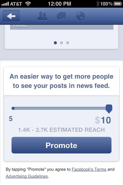
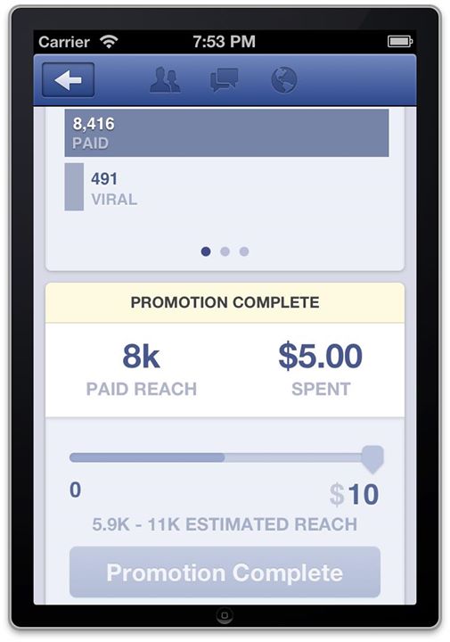
While I was setting the technical stage for our product launch, another intern, Leo Mancini, was responsible for rethinking and designing the entire Page insights experience on mobile. After bringing Leo up to speed on the current state of the app, he came back to me in a few weeks with an amazing interface that blew me away. With just one slider and a confirmation button, the new UI could create, pause, play, stop, and adjust campaigns for a promoted post. Even better, just above the campaign box is a carousel insights view where admins can see the direct impact of their campaigns. It makes the entire Page management process seamless, dynamic, and responsive; implementing it was my favorite part of the summer.


Now towards the end of our internships, Leo and I labored over every box shadow, corner radius, bezier animation path, and pixel alignment (sometimes well into the night) until we were absolutely sure it was perfect. It felt great to put so much effort into a historic interface and see our work make the ship deadline. I’m really proud of the feature, thankful for the opportunity, and excited to demonstrate Facebook’s dedication towards mobile. Even better, I’ll get to experience Facebook’s culture full time when I return in the Spring.
The feature and many other improvements are shipped with Pages Manager on AppStore, and I highly recommend that all page admins check it out.
Peter Cottle is a graduate student in the mechanical engineering program at UC Berkeley, where he is currently a GSI for an Artificial Intelligence course. He will be joining Facebook full time next spring.


