In August 2020, Instagram launched a set of dynamic and fun text styles followed by animations to give people more choices to express themselves on Stories and Reels. This was the first major update to Stories’ text tools since 2016, and we wanted to share how we approached some obstacles we encountered and what we learned along the way. With all the surprises thrown at us throughout the development of this project, we’ve included our own surprise for our users on iOS: We hid one extra text style for you. ✨ Comment if you find this Easter egg, but don’t ruin the surprise for others!
What we built
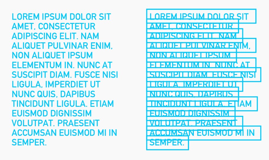
The image below shows the full suite of text styles we provide on Stories today. The ones outlined are the new styles we added as part of the project. As we embarked on this project, one of our core principles was consistency. Previously, only certain styles, including Typewriter, Classic, and Neon, had decorated versions, and Modern v2 did not. With our new project, all styles have decorated and non-decorated versions.
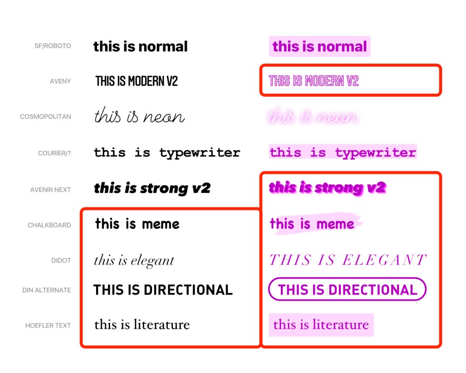
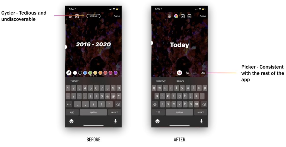
We also updated the outdated single button toggle to a much simpler text style picker, which allows users to easily browse all the style choices and is consistent with the rest of the tools in the app.
Fonts on Android
Very early in the project we found that although all the fonts that we wanted to add were packaged with iOS by default, they weren’t available on Android.
To solve this problem, historically we’ve just included the appropriate font files into our APK or Android Package, the file format Android uses to distribute and install apps. But the Instagram app has grown over the years, and we could no longer use this approach. Any addition of app size has a material negative impact on the app’s ability to run on lower-end devices. Also, according to“Shrinking APKs, growing installs,” a Google Play article, “For every 6 MB increase to an APK’s size, we see a decrease in the install conversion rate of 1%.” The font files we needed added up to 4.5 MB, which would result in around 700K fewer installs of IG every month.
Instead, we tried Google’s Downloadable Fonts framework, which handles downloading and caching of fonts between apps and allows apps to share them. After we finished building it out, we realized the framework was missing a couple of essential fonts for our project.
Finally, we built a custom solution using Everstore, an internal BLOB (binary large objects) storage solution. Everstore is based on Haystack and provides a client API for automatically fetching, registering, and caching the assets. Instead of just building something for Stories, we worked with asset management experts to create a generic repository that allowed users to access fonts anywhere in the app. This approach had the added benefit of not relying on a third party, which gave us greater control over our product.
Dynamically evolving designs
One of the best things about this project was the close collaboration between engineering and design. After getting the initial set of new text styles from our designers, engineers ran with those designs and typically came up with their own implementations on each platform. This involved a lot of math and deciphering the “noodles” of sketch files while building animations. Sometimes, however, technical limitations made it difficult to implement a particular style. This is where the live collaboration with design became an important asset.
For one particular text style, which we called Directional, we intended the decorated version to look like this:
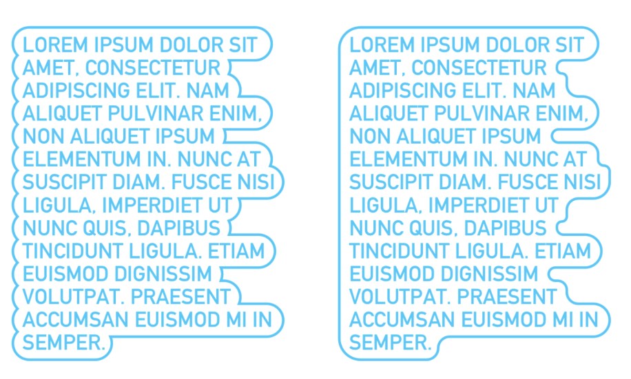
The guidance from the design team was to build whichever was easier to implement. We tried a few approaches.
Drawing arcs
For the style on the right, we tried to use Apple’s addArcWithCenter:radius:startAngle:endAngle:clockwise: to draw arcs between the points that defined the shape of the text. However, we ended up with scenarios where the arcs wouldn’t meet each other perfectly.
In order to mitigate the misalignment, we tried to do the same thing using a bezier path for the outline instead. We’d either append a quadratic curve or a line, depending on the shape of the text. After putting together this algorithm, we were disappointed to see that we ended up with the same result as above.
Creating a bezier path around many bezier paths
For the style on the left, we tried to create a giant bezier path that outlines many bezier paths. We started by creating bounding rectangles around each line of text. Then we rounded each of these bounding rectangles.
Next, we created a function that essentially defined the outline shape we wanted by returning a BOOL for whether a given point was inside or outside the outline shape.
Finally, we used this function to create a contour by visiting every point in a rectangle and assigning an edge type to each point based on the function, and then used an existing function to transform that contour to a bezier path. This solution worked well for most cases, but was noticeably laggy for large amounts of text. We consulted with the design team and decided to evolve Directional’s decorated version to have a filled background instead behind the text.

An example of a specific font style implementation
The Classic text style uses a word-by-word reveal animation. But what is a word? Separating strings by spaces seemed like a good place to start, but we quickly realized the approach would not generalize to all the languages with which people use Instagram. After a bit of digging, we discovered natural language processing APIs available on iOS (see NSLinguisticTagger, now replaced by the Natural Language framework), which could break up a string into its constituent tokens linguistically, and we implemented our word-by-word animation using that functionality.
During the animation, there are three ranges of text to consider: the range that has been fully revealed, a word that is currently being revealed, and the rest of the string that is hidden. We use our natural language word splitting algorithm to determine these ranges based on a given current time in the animation and the total animation duration.
Obstacles in working with text
Android native crash debugging
At Instagram, we test each new feature and change to the app via A/B testing on small random samples of our user base before we roll it out for everybody. This ensures that new changes don’t introduce measurable regressions and that we have good data-backed reasons for any additional complexity we want to include. Because we rolled out our new text fonts to a small number of users, we were able to compare to a control group that didn’t have the new fonts. To our surprise users in the test group were crashing slightly more frequently than our control group.
We reused a tested infrastructure that fetches from our storage layer and then locally caches on device. Because of our confidence in this infrastructure, we spent a month looking in the wrong direction to find the cause of our crashes. In reality, the problem was actually within that tested infrastructure, which failed to clean up the files it was allocating.
Dealing with ligatures, RTL text, emojis, and more on Android
The Typewriter and Literature text animations are character-by-character reveal animations that show a blinking cursor to mimic the visual effect of someone actively typing. In stories on Android, all stickers and text that are added to edit a story are powered by Drawables. At first glance, it seems this could be achieved by storing character offsets to reference and draw each character individually in the reveal based on some animation progress. However, we had to consider quite a few text-specific features, which made our implementation a bit more challenging:
- Ligatures
- Emojis 🎉
- Text alignment (particularly important for RTL vs. LTR text)
- Text color (for some fonts: different portions of colorized text)
- Text emphasis
- #hashtags and @mentions
The last three features (color, emphasis, and underlines) are each powered by custom Spans, and we had to support all of these for every new text animation style provided by our designer. Initially, while working on this project, one of our teammates pointed out a bug where the animated text was broken for RTL languages, such as Persian. From there, we found further bugs with RTL languages in our new styles and their emphasized versions, including problems with languages with ligatures.
Ligatures posed a problem for the character-by-character reveal animations since each is “a special character that combines two (or sometimes three) characters into a single character.” Thus, we can’t simply reveal each character the same way we do with English words. Instead, we want to build on top of each character as we reveal it.
For example:
The word love in Persian is عشق. Drawing each character individually would read ع ش ق, which is not legibly the same.
We took a couple of approaches to solve for this text animation style, each with its respective trade-off. The first was relying solely on TextPaint and Canvas#drawText(): The basic idea was to keep a reference to the full text that would be rendered, and only draw a portion of it based on the progress (from start to “latest revealed character”). This would take care of ligatures since the text that would be rendered at every frame would be grouped together, as opposed to drawing each character separately.
In order to handle emojis, we took advantage of BreakIterator#getCharacterInstance() to properly reference the correct position of the latest revealed character in the text.
TextPaint offers some APIs for setting text color, so this approach solved for most of the features we were required to support, but it fell short of rendering underlines (for @mentions and #hashtags), text emphasis, and selective colorized text out of the box.
For example: For some fonts in stories, you can tag friends by adding an @username and select different portions of the text to be different #colors (we call this “selective colorized text”). 😛
One of the main reasons for this was that these were implemented as custom spans that would render our text differently based on where the span was applied (something that Canvas#drawText() would not account for). To solve for this, we went with a different approach to cache StaticLayouts for portions of the text that we would render at different frames, and use those to draw each line and character based on the current animation progress. This had the added benefit of supporting Spannable text (to include the underlined/selective colorized portions of the text) as well as layout-specific parameters such as alignment (which helped us lay our text out properly for RTL vs. LTR languages).
A final note on Canvas APIs: We also considered using Canvas#drawTextRun() in our first approach, which would have been ideal for drawing individual characters and taking care of ligatures, but unfortunately it was only available on API 23+. In favor of keeping things simple and our codebase clean, we opted for StaticLayouts.
On iOS, we also faced similar problems with emojis and letters not being a single character. However, on iOS, the solution was more straightforward. Once we addressed the assumption that not every letter or emoji was a single character, many of our bugs were fixed.
Takeaways
One of the biggest takeaways from this project was actually nontechnical! Throughout the project, we had an engineering and design chat that we used to quickly iterate and get fast feedback on our implementations. The chat was limited to individual contributors (no managers allowed!), which made it a low-pressure environment where we could prioritize craft and polish. The engineering team felt free to bring up edge cases that they had questions about, and everyone in the chat, Android and iOS, benefited from hearing the designers’ feedback at the same time. The chat was also useful for quick iterations on small polishes. For example, quickly iterating on what the best line height multiple for a text style involved just sending a couple of screenshots back and forth. Read more about the benefits of a collaborative engineering/design chat here.
Another takeaway is the importance of regression testing/continuous testing for a project like this. With so many edge cases involved with text (emojis, RTL, ligatures), doing quality testing just once did not cut it — we were often surprised by the new things that broke after we fixed a bug. Doing continuous quality testing in multiple languages would have helped.


