When I started at Facebook, I joined the newly formed cache performance team in production engineering. Our goal was to get a handle on the health of our various cache systems and to facilitate quick troubleshooting, starting with answering the question, “Is this problem being caused by the cache?”
We ultimately came up with a monitoring tool called Claspin that uses heat maps to present the status of our cache systems in an easy-to-interpret format. But to build this, we first needed a deep understanding of how cache works at Facebook.
Cache at Facebook
Facebook has two major cache systems: Memcache, which is a simple lookaside cache with most of its smarts in the client, and TAO, a caching graph database that does its own queries to MySQL. Between these two systems, we have literally thousands of charts, some of which are collected into dashboards showing various latency, request rate, and error rate statistics collected by clients and servers. Most of these graphs and dashboards are backed by Facebook’s “Operations Data Store,” or ODS. This worked well at first, but as Facebook grew both in size and complexity, it became more and more difficult to figure out which piece was broken when something went wrong. So I started thinking about encoding the “tribal knowledge” we used for troubleshooting in a way that would make it easy for people to assess the status of cache at a glance.
Visualizing the problem
Initially I thought about creating a system analogous to meters and traffic lights, but it didn’t take long to realize I couldn’t build a binary tool that could say for sure if something was wrong or not. So instead I started thinking about ways to visualize all the relevant metrics at the same time, along with other tribal knowledge about how much concern we should have about each metric’s current value. My first stab at the problem was to write a command line tool that listed hosts with the values of key metrics, sorting them in order of “badness.” I defined “badness” by ranking hosts by each metric separately, then sorting the rankings and hosts by a tuple. For example, a host that was number one in timeouts and TCP retransmits but number 10 in request rate would have its sort key be (1,1,10). Showing the host’s rack as well made it possible to quickly see when a bunch of hosts in a rack were having problems. The output was a lot of text, though, and it required interpretation by someone who knew exactly what they were looking at. While this made my job easier, it wasn’t what I was looking for.
The solution: heatmaps
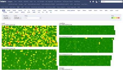
I’d been fond of heatmaps for quite a while, but it wasn’t entirely clear to me how to lay out this data in two dimensions in a way that would be meaningful to the user. It seemed somewhat obvious that we wanted each “pixel” of the heatmap to represent a host, with racks grouped together. However, our racks don’t necessarily have the same number of hosts in them, and it wasn’t clear how to color individual hosts when we have about a dozen metrics for each. The heatmaps we were already using internally would display the range of a single statistic over a group of servers organized into clusters and racks, but the layout was pretty sparse and not that many servers would fit on a single page. And since the existing heatmaps were a general tool, colors were based on the range of the statistic without any clue as to what represents “good” or “bad.” Eventually I realized that all we cared about was whether anything was wrong with a host. So I settled on coloring a host by its “hottest” statistic, with hotness computed from predefined thresholds. It’s dirt simple, but it gives us a way to encode tribal knowledge about what values are “bad” into the view. Hosts that are missing a stat are colored black, indicating that the host is probably down. After playing around with various arrangements and seeking feedback from others, I settled on a separate heatmap per cluster, ordered by rack number and with each rack drawn vertically in an alternating “snake” pattern so racks would stay contiguous even if they wrapped around the top or bottom. The rack names naturally sort by datacenter, then cluster, then row, so problems common at any of these levels are readily apparent.
Claspin is born
When I wrote the initial prototype, I asked a friend to suggest a name. Having a background in organic chemistry, he suggested “Claspin,” which is a protein that monitors for DNA damage in a cell. Claspin allows us to visualize a ridiculous amount of information at once, in a way that makes it easy to spot problems and patterns. On a 30″ screen we could easily fit 10,000 hosts at the same time, with 30 or more stats contributing to their color, updated in real time—usually in a matter of seconds or minutes. This is a lot of data, and Claspin leverages standard Facebook components to process it, collecting all the stats server-side and sending them up to the browser, where coloring decisions are made in JavaScript and the heatmaps themselves are drawn using SVG. Even when a problem is ongoing, it’s easy to see when things change because a particular problem will have a particular pattern on the screen.

The tabs at the top are the various views, most of which are different services being monitored by Claspin. The blue pill buttons underneath allow the user to color hosts by a single stat. The names of the stats are mnemonics I made up for much longer names — “rxmit” is TCP retransmits, “to” is timeouts, etc.

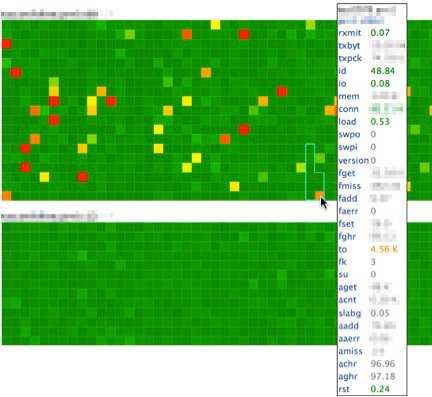
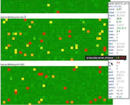
Mousing over a host draws an outline around its rack and pops up a tooltip with the hostname, rack number, and all the stats Claspin is looking at for that host, with the values colored based on Claspin’s thresholds for that stat. You can see here a rack that wraps around the bottom, demonstrating the effect of alternating directions. Stats with no defined threshold are gray, but they’re collected so we can try to figure out why a host has, for example, high timeouts.

YO DAWG I HERD YOU LIKE TOOLTIPS…
More recently, others have enhanced Claspin by adding support for additional backends and custom palettes (especially useful for those who can’t distinguish red from green and for situations where a value isn’t necessarily good or bad). They’ve also moved the configuration into revision-controlled text files with nearly instantaneous propagation of updates. By making the configuration more user friendly, this enhancement has more than doubled the number of teams using Claspin to monitor their own services. It’s quite gratifying to walk around the campus and see Claspin up on the wall-mounted screens of teams I didn’t even know were using it.

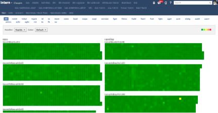
When I first deployed Claspin, the view above had a lot more red in it. By making it easier for more people to spot server issues quickly, Claspin has allowed us to catch more “yellows” and prevent more “reds.” I suppose there’s no better validation of one’s choice of statistics and thresholds than to have things start out red and then turn green as the service improves.


