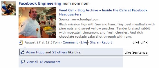
Facebook’s News Feed has become increasingly feature rich over time, allowing users to interact with their friends’ stories in new and interesting ways. The introduction of the Like feature, launched in February, has been a huge success with an average of 0.3 Likes per user on the average day. The comment and Like box appearing below most feed stories is known as the “Universal Feedback Interface,” or UFI to Facebook engineers, and is an important aspect of communication among Facebook users. These new methods of communication do come at a cost, though.
In July, Lior Abraham, an engineer on the Feed team, presented the results of a study he had done on the markup size of the home page. He discovered that 34% of the markup on the home page was due to the UFI. Since the UFI appears on nearly every page on the site, reducing the markup on this feature would lead to page size wins across the board. In particular, the Like feature was selected as an aspect of the UFI that could be slimmed down.

The desired behavior of the Like feature is fairly simple: when a user clicks Like, the Like sentence above the comment box should update to include the user, and the Like link should change to an Unlike link. The previous implementation of Like accomplished this by sending two complete sets of markup to the user. One set included the current user in the list of people who like the item and had an Unlike link, and one excluded the user in that list and had a Like link. CSS rules then ensured the user always saw the applicable sentence and link. When the user clicked Like, a javascript function switched between the two links and sentences. This approach made the Like feature feel quick to the user. Because all the markup was already loaded, there was no delay between when the user clicked Like and when the link and sentence updated.
The issue with this approach was its markup cost. Every time a user did not click Like on a given story, the hidden sentence and link were wasted. Those bytes could have never been sent, and the user would not have noticed. While the Like feature is well-used, a slight change in user experience would be well worth it if the size of home.php could be significantly reduced by omitting the second set of markup. To do so, a small modification was made to the Like functionality. In the modified implementation, when the user clicks Like, the page makes an asynchronous call to Facebook’s servers, which returns the new markup for display. Once that asynchronous call returns, the new markup is inserted into the page in the exact same spot as in the prior implementation. Because the markup structure remains the same as before, nearly all the javascript behind the Like functionality could remain unchanged. With this new implementation, the behavior of the Like link stayed mostly unchanged, but there was a slight issue. The Like link would only change to Unlike after the asynchronous call returned, since the second link was omitted from the initial page. This meant that the user had no visual feedback that the Like action had been triggered until after an asynchronous call had been made, which significantly degraded the user’s experience. Compared to the sentence, though, the link was a very small piece of markup, and it costs very little to send both links. Hence, we went back to sending both links to the user on initial page load, while waiting until the user clicked to send the new sentence. This led to a slight decrease in markup savings, but made the user experience with the new system nearly indistinguishable from the old system.
While seemingly a minor change, the savings from this proved to be quite substantial. A UFI with no likes or comments used to be 1.7 kilobytes, despite not even being displayed on the page unless the user clicked Like. This change reduced the size of that empty UFI to under 100 bytes. A UFI with just a like sentence was also around 1.7 kilobytes which was reduced to around 900 bytes with this change. In early August, around three weeks after the presentation on markup size, the updated Like markup was pushed to the live web servers. At that time, the average size of home.php was around 250 kilobytes. This change decreased the average size of that page by 20 kilobytes. Without reducing the user experience, the homepage of Facebook had become around 8% slimmer. Finding small changes like this to make the site faster is one way that we can help improve Facebook for our users.

Dan Schafer, a summer engineering intern, just started his senior year at Carnegie Mellon University, and hopes this page loaded just a little bit faster for everyone.


